Negative space is, as you might imagine, hard to define.
Either the lack or the overabundance of negative space can throw off a whole design in an odd, hard-to-explain way.
A viewer tends to instantly notice this problem, and it makes him or her almost immediately dislike the design.
The use of negative space and how it affects a design, whether that is interior, graphic, or even art design, two dimensions or more, can be hard to put your finger on. It is even harder to get negative space design right. Here are some tips for how to use negative space well in all your designs.
What is Negative Space?

A good way to define negative space is very simple: negative space is the open or empty space around and object that lends that object its own definition. Another way useful negative space definition is a kind of the breathing room around a central subject that affect its appeal. How can you know an object’s true shape if you can’t figure out its limits?
It’s easy to tell when negative space isn’t present. Most people dislike a cluttered, suffocating design. Negative space allows for clear borders and definition. The design elements do not look good when they blur together into a blobby mess.
With proper use of negative space, these elements are divided into sections, which allows viewers to understand them and what they convey in discrete pieces. This way, it is easier to process and understand the whole design and each of its detailed aspects.
What Makes Negative Space So Effective
Once you understand the general concept behind negative space, you can start to play with it and leverage it to your advantage in your designs. Properly composed negative space can make all the difference in a design.
Viewers will appreciate a design with good use of negative space, much more than cluttered, busy, claustrophobic design. It ensures that viewers do not have to work very hard to see the details and fine touches of the design. Balancing out negative space in your design eases the eye into the design and makes it easy to look at.
Designs that rely heavily on negative space are usually very simple. This simplicity can be deceptive, as there is normally much more tot such designs than viewers initially assume. Clever and creative uses of negative space reward viewers. Once they understand the subtle hidden messages or images in the design, they feel included.
This sense of being aware of the inside information is highly enjoyable. It is especially effective for negative space logos and designs with similar purposes, as they tend to stick in the viewer’s mind. Because of this, negative space is a great way to enhance and add appeal to your designs.
Using Negative Space in Composition
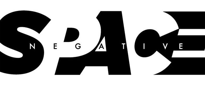
Few things will have as much an effect on your design’s composition as negative space. In many ways, negative space will define your composition. Without the use of negative space, even the simplest designs will look complex and busy. In artwork this can be particularly noticeable. Without negative space, a simple piece comprised of smooth lines will look snarled and compact.
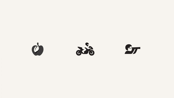
If text or a title is a part of the artwork, it can be easily lost. Messages, symbols, and other subtle touches can be lost. If it’s too crowded, especially if it has a busy color scheme, the piece can be unpleasant to look at and will drive viewers away. On the other hand, a piece that uses negative space well draws focus to where you want it to be.
It showcases important and subtle elements in the design. Negative space art and design is all about making sure the composition highlights important elements.
Using Negative Space for Type
It’s easy to think of negative space only as an element of composition. However, it can also be used very effectively for type. In typography, the negative space between each line is called leading.
Leading is important because it makes the type much easier to read. Without it, the text may be rendered almost absolutely unreadable. Reading a paragraph with no or barely any leading is much, much harder than reading a paragraph with leading.
Without enough leading between lines, it is very hard for the eye to determine where the next line of text is. This will cause readers to skip or re-read text often. The human eye and brain do not process such tightly placed text very well (at least in the Roman alphabet; for other writing systems, take a look at the size of their normal leading).

Having to do this causes a lot of frustration and will probable cause people to quit reading the text altogether. This is the last thing any designer wants, as it means the information is not conveyed.
Beyond just the practical aspect of using negative space in type, it also brings a certain aesthetic element to any text. Using negative space in combination with the weight of the text creates a sense of visual texture on a surface. This texture is not something you can detect easily off-hand.
Squint your eyes and you will see the relationship created by the use of negative space in the text. It is created by the space ratio of what is visible and how the letters and words associated with each other. A lower leading amount will make the text look darker because it is much more densely packed. It is very attention grabbing.
A larger leading amount makes text seem more spread out and less demanding of attention. Using these can help you figure out how to highlight (or draw less attention to) parts of text, including headlines.
Using Negative Space to Increase Readability

For both hard-copy and web pages, the spacing is very important for making sure readers can understand your text. For the web in particular, since web pages have only a few moments to connect with visitors, easily readable text is absolutely vital.

Most webpage visitors are not looking for a leisurely read, as they are with a newspaper over breakfast or a book before bed, but they are instead looking to get relevant information quickly. You text should be placed so that it’s easy to read and important information is easy to find, especially if you are selling a product or service.
Use white space wisely to reduce clutter and create buffer between elements. This space will allow visitors to pick out what they were looking to learn quickly.
Using Negative Space in Web Design
Negative space has a significant place in web design beyond just tis use in text. In the information age, getting important information across quickly is extremely important. Even video game User Interfaces are designed to this end, and a poor User Interface can lead to negative reviews.
It turns out that a thousand lights and bars flashing are not very helpful when fighting off digital aliens and people will only take the time to look at what they need to in order to accomplish their goal. Negative space allows the important things to receive the focus they need.
The same mentality carries over to effective web design. Use negative space to highlight what’s going to be important to visitors to a site.
Take a look at the most significant and successful web stores. Amazon, for instance, uses negative space to highlight the most important facts for potential buyers as soon as a page loads: the name, a picture, the price, the user rating, relevant facts about the product, sample downloads for books, and –right up on front—how to buy the product.
Above this, of course, is the search bar, another key feature of the site. It is easy to find what you want to know about a product and how to get to it right away. Important times are not buried in clutter, but instead float prominently on white space.
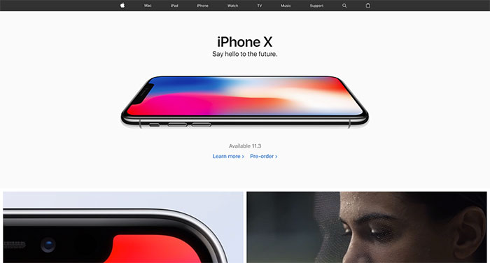
For a more complex example that makes very good use of negative space, look at the Apple Store. Apple uses very minimalist designs for all their products and their store is no exception. Products and prices stand highlighted on neutral colored negative space, easy to read and identify.
You see a similar design in their physical stores, with products standing like pieces of art on simple tables and against clean walls. They are remarkably consistent and intelligent about how to use negative space to sell a product.
Using Negative Space to Communicate Luxury and Sophistication
You might notice, when looking at modern furnishings and interior designs, that many of the most luxurious rooms are quite minimalistic. They are not crowded with artwork, but rather make clear that what few items are in the room are worth quite a bit of money (or seem like they are, anyway).
A similar use of negative space in other kinds of visual media can achieve the same effect.
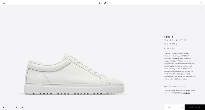
A copious amount of white space adds a touch of class to a simple, generic webpage. Your products and services seem more important the place that they can be found in. ‘Less is more’ makes products seem like they have a higher quality, because you are not trying to pull any gimmicks or pointless flair to sell it.
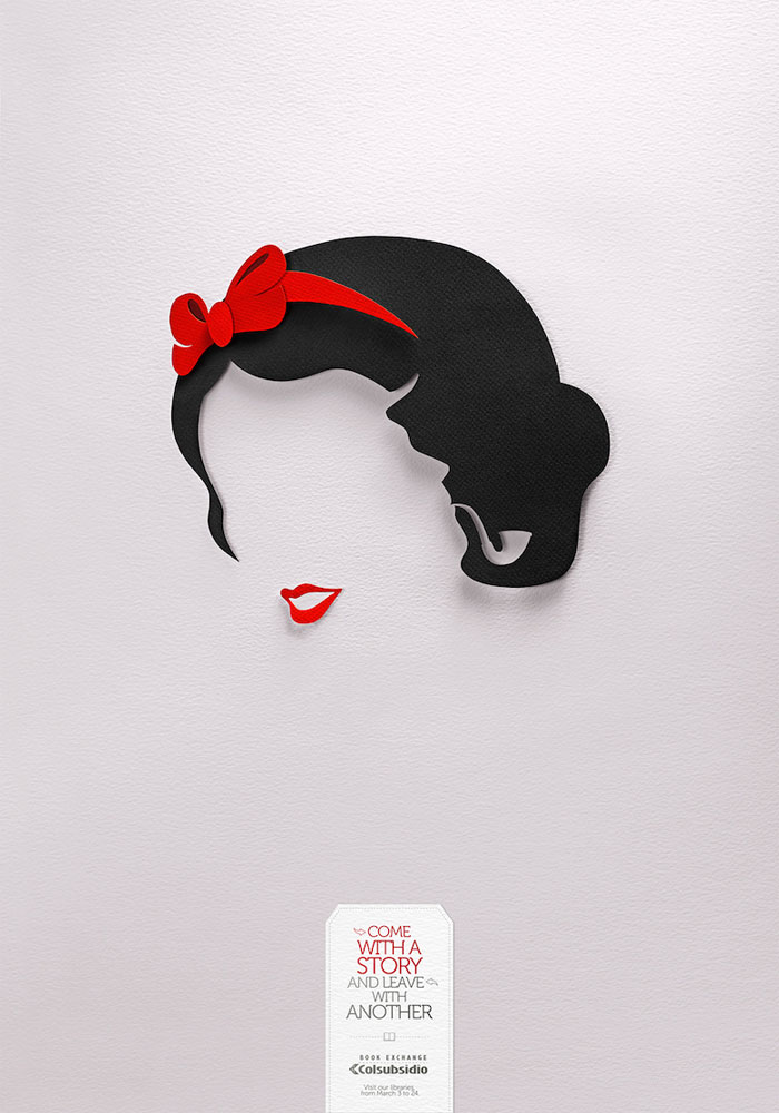
You do not need very much content to make a product or service seem high-end. Keep taglines minimalist as well. Information should be to the point; you often see details spelled out in less than seven one line bullet points, most of which are not complete sentences.
Look at top-rated sites that sell sophisticated goods and services, like high-end furniture or luxury spa services. Notice how they utilize negative space and minimalism to show you how good their product is.
One of the easiest ways to identify a cheap product is how much it tries to cram information and graphics on every inch of its website. Ads are often found everywhere, promoting low prices and seasonal offers.
There are a wide assortment of products displayed on any given page, sometimes crammed into the same pagespace as similar items, begging for you to buy something. There are often ‘price stickers’ showing how much you will save if you buy now or how much the product used to cost. It is very busy and comes across as a jumbled garage sale, not a quality store front.
What Does “Improving White Space” Mean?

Occasionally, especially if you are new to web design, people will say you should ‘improve the white space’ on your design. What does this mean? It’s easy to assume that the negative space is just left over space, the parts of the page you did not use.
However, there is a lot more nuance to the use of negative space than you think. There are a lot of small tweaks and tricks you can do to make your negative space do more for web page and product. You might be surprised how small, simple problems can make a big difference to how your negative space works on site.
Margins and Spacing

Inconsistent spacing can cause a lot of problems on a website. It can make your page unbalanced and hard to read, working to bury pertinent information. However, inconsistent spacing is an easily remedied problem. Just tweak it so that everything looks even, balancing out the white space and helping focus visitor’s eyes on the right information.
Make sure you do the same for the page’s margins. Weird, uneven margins make a page look strange, cheap, and badly made. Visitors usually click away very quickly. Always preview before you publish, as all it takes to make spacing and margins uneven is a bit of code. Fortunately, it is usually just as easy to fix.
Micro-Level Spacing

Micro-level spacing is the negative space between the smallest parts of a page, like the letters in the text. This includes leading. The right leading makes a serious difference to the legibility of your text. The larger the leading, the easier it is to read.
Too much, however, can cause issues with legibility all its own, making the text a chore to read and making the page seem disconnected from itself.
Make sure you choose a readable font that works for the amount of text you are using. Very flashy, thematic fonts can work great for short title or headline, but when put together in a normal text, they can have strange spacing between words and letters that can be hard to read. Your information will be lost and a user will swiftly click away to a more legible site.
Negative Space vs. White Space
‘Negative space’ and ‘white space’ are interchangeable terms. White space is typically used in regards to print publishing, while negative space is a term often used in art and other forms of design. They refer to the same thing, however: unused or open space in a design, to include text.
White space is the word publishers and copywriters, as well as designers working with any form of print (newspapers, books, and magazines), use. They use white space because the open space on paper is normally white instead of some other color.
Other designers use the term negative space for the same concept. The term originated with photographers in reference to the space behind and around the actual subject of the photo (positive space).
Negative space is often used to refer to any kind of area that is not meant to draw attention. It can be any color—the sky is often used as negative space in art and photography, for instance. Patterned backgrounds, such as many websites have, are also a kind of negative space.
Sometimes web designers confuse white space with negative space that is only colored white. Make sure those you are working with understand the terms you are using. Make it clear that negative space/white space does not have to be white.
Colors, patterns, and even background images work just as well if chosen properly, and sometimes even better depending on your overall web design. Ask anyone who is confused to think of how their desktop background image works on their computer. It is a kind of negative space against which you place application programs.
Negative space serves to unify and focus your entire design. They render text readable and highlight important information, images, and objects. You will not likely notice white space if it is done well, but the lack of it, or its improper execution, will stand out immediately.
Every visual project, printed or on the web, has an element of white space. Every style guide or style sheet includes it in its guidelines. Too little space makes everything feel claustrophobic and difficult to process. It becomes a jumble of information that can cause headaches depending on its colors and arrangements.
Too much leaves a design feeling internally dissonant, even completely unconnected, more like a random collection of images or text than a cohesive, thought-out whole.
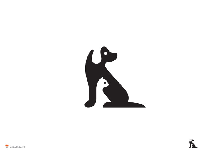
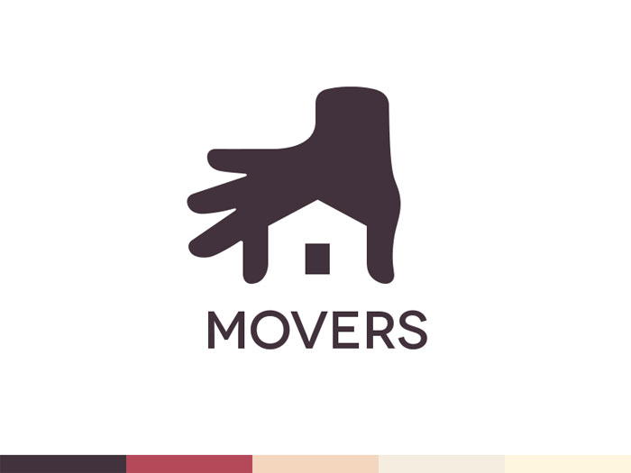
The most memorable, simplest way to see how this works is in good logo designs found on the web. Think of Apple’s apple symbol, with its noticeable negative space in the bite, or Nike’s simple, instantly identifiable swoosh. Each of these are great examples of a negative space logo, where wise use of white space draws the eye and allows for a viewer to remember the logo easily.
Neither is sparing of its use of negative space, either, so remember that you should not be afraid of using it in your designs. Negative space will not automatically kill a design or render it unmemorable.
Experiment with what works best. Using negative space is something that requires practice. Your goal should be neither overuse nor underuse, but instead a use of white space that draws the eye and balances the design.
Even small tweaks and simple changes can make a big difference. Create drafts and look at previews side by side to see what works best and don’t be afraid to make adjustments based on viewer feedback or technological developments.
Negative Space and Breakpoints
Negative space has started to make an appearance in responsive design. Designers have begun to use negative space to help deal with the differences between browser sizes and different breakpoints in responsive grids. It is also being used to deal with oversized browser widths.
This is often pretty often unnoticeable. It is usually just a small bit of space on the left and right of the screen. More and more, though, designers are being creative with this use of negative space. Not very long ago, many designers just left this space blank, often with the same color as the background.
Now, many designers are adding extras into these spaces. This is normally a patterned background, but you should take the opportunity to try new things to see if they work or not. Nothing is set in stone, so feel free to experiment.
This is not a necessary addition to your design, remember. Depending on your overall design, it can be a very fun and playful feature. Many of the more creative websites use this breakpoint negative space to bring more to their pages.
It is a small detail hat can do a lot to impress visitors and make the site seem more professionally well-crafted. It needs to be an unobtrusive addition that is incorporated into the design with care. There’s nothing wrong with keeping the breakpoint white space simple, however, and it may be a better for your site design.
Conclusion

Negative space is an important element of design. Without it, your designs will likely be a disaster, lacking definition and focus. Use too much, however, and you don’t have a design; you have a random collection. Use of negative space is a balancing act meant to unify a design and draw a viewer’s eyes comfortably into the details and subtleties.
Play with negative space in your drafts and ideas. See how it looks in the completed project and make adjustments depending on outside input. You’ll be surprised by the ways you can use negative space and how it can help your design look more complete and pleasing.
If you liked this article, you should check out these as well:
- Graphic Design Resume: Best Practices and 51 Examples
- Letterhead Examples and Ideas: 60+ Cool Stationary Designs
- 18 brilliant examples
- Examples on Canva
The post Negative Space Design: What it is, Logos and Art Use appeared first on Design your way.
