Bad logos. We see them from time to time surfacing online. But how do they end up appearing with the plethora of tips and best practices that we have about creating a logo design?
Let’s dive into the subject.
Businesses have a major advantage and that is better exposure and potential customers identifying your brand by its logo. It is the first thing a client sees, and it must make a memorable impression.
Some business owners want their logos to be something way out-of-the-box. Others want a way to communicate their brand positively. Irrespective of their wants and needs, there are vital aspects that they cannot ignore. It will make the difference between a good and a bad logo.
Why is Logo design so important?

You want to present your brand as best as you can, and it is an essential tool to connect the right customers with your brand.
Customers identify your company by its logo, even though it is not an exact science to get a logo perfect. It takes experimentation, hard work and creativity to get a logo that presents your company.
While creating a good logo is not a formula that you need to follow, you must understand the basics of a good logo. The best way to explain what makes a good logo is to look at what bad logos consist off and where you could potentially go wrong.
What makes a bad Logo?
A good logo design is memorable and simple. People want to identify with the brand, and it should clearly represent the brand. What does a bad company logo have in its design?
- Your logo will come off an as unsophisticated and clunky when the colors and the color combination do not match the company brand and its message.
- Raster graphics also make for a bad logo. These are images that cannot be scaled to the desired size. This means that the logo will have a blocky appearance.
- Copying a successful and established brand and your design is not authentic.
- When you go for an overly simplistic design, it is a mistake as it comes across as a design that wasn’t planned, or any thought went into it.
- A mixture of conflicting images and too much complexity is as bad as overly simplistic. It undermines your brand’s purpose.
- The right font can either make a logo or ruin it completely
Decent logo design requires thoughtful marketing and deep psychology. You want to understand how to present a brand and design an identity that reads well.
It is very easy to find bad logos when you search the web. You will immediately be able to see what a professional logo design is as opposed to a logo that was simply haphazardly thrown together. You need to find the middle way and not design a logo that is neither good nor bad.
Examples of bad logos
Key to success
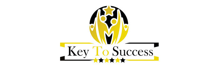
This bad logo design feels as if it is hitting you straight in the face. Its super flashy yellow is far too overwhelming and a bold in-your-face look that is hard to look at. It is good to remember that a logo should be user-friendly and print-friendly and when you print this bold and bad logo it will look worse. Especially with the chunky frame around the text.
The yellow stars too are unnecessary and make the logo tacky and the yellow text is too hard to read or decipher. You should avoid using too many shapes and gizmos and keep the design simple and clean. When you use more than one color, make sure they complement each other.
Cazz’s
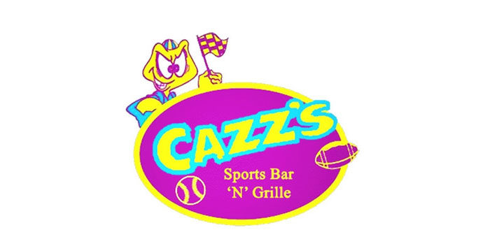
Another bad logo design with a combination of bad aspects that include poor spacing, bad textures, and gaudy colors. There are zero relationships between symbols and text, and nothing is memorable here. Bad logos often have the same elements as seen here, too confusing, too loud, too bright and overdone. It does not make any sense and a possibly good brand’s quality goes down the drain.
Smashing solicicors?

Without telling you, you know here the big mistake is and where the designer went wrong when looking at this logo. You cannot make out what the name read, and the far too modern typographic font is used in the design.
NJ Brew Tours
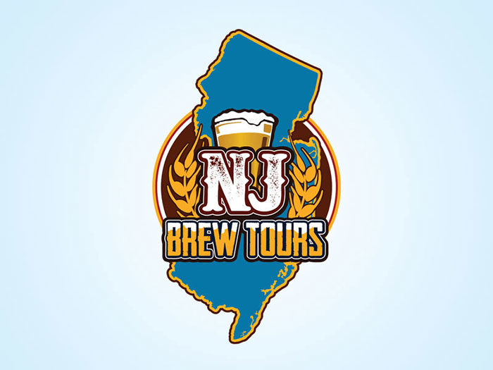
You will need to concentrate on this logo and to be honest the design, shape, and colors do not blend or look attractive in the least. It is too bold and too bright and therefore a bad logo design.
Psyc by the sea
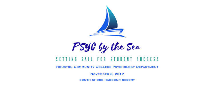
When you are looking for a good logo design, keep in mind that you are not designing a business card. One thing that you never do as shown in this logo is adding a full address and a date too. A professional logo design does not have more than three lines and you have to make the text readable too.
Coraline
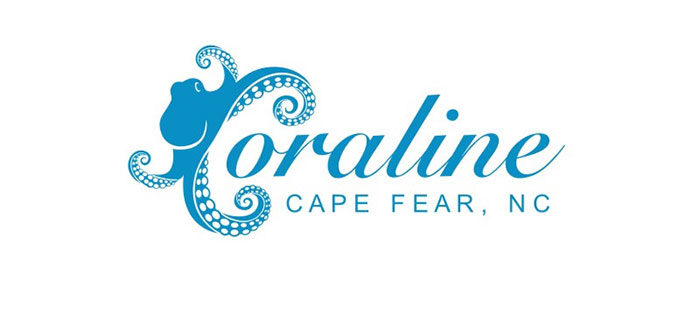
This logo shows an Octopus as a C which is the first letter of the word. While it is not the worst logo, it is very confusing as the Octopus takes the attention away from the actual name. you will be confused when trying to remember this company’s name.
Eazy Zed

Here you have a confusing logo with far too many sizes, fonts, and texts were thrown into one bad logo. Too many colors that do not match, various types of fonts and text sizes are confusing to the eye with nothing coherent about the logo. Keeping it simple, where you have no more than three lines of text. Overlapping elements as this logo depict should be avoided.
Smashing Productions
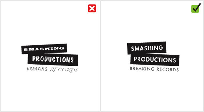
This logo is another example of a combination of bad logos thrown into one. It uses three different typefaces and you need time to wonder which is which and recognize them. It is a confusing logo and it is standard practice to use no more than two fonts if need be.
Microsoft Bing

A well-known company that continues to design bad logos is Microsoft. They even got the embarrassing honor of being awarded as the company with the worst logo design for 2009.
London Olympics 2012
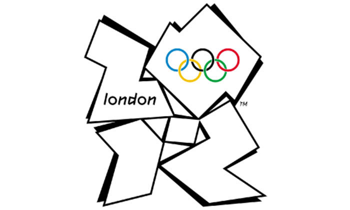
London has magnificent landmarks which make designers wonder what went on in the minds of the developers of the dissonant logo for the 2012 London Olympics. Bad comments include that it looks like a distorted Swastika. It is one famous bad logos that designers were embarrassed to see.
Airbnb
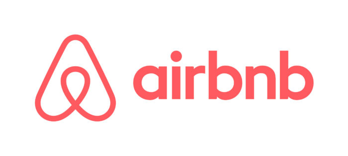
Airbnb is a home vacation or guesthouse type service rental platform with a good example of bad logo design. Advertising and branding experts agree that it is a bad logo with a cross between a triangular paperclip and the female anatomy. It’s also copied from a decades-old branding manual.
More bad logos examples
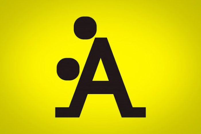
A Style
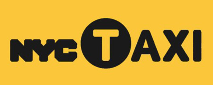
NYC Taxi
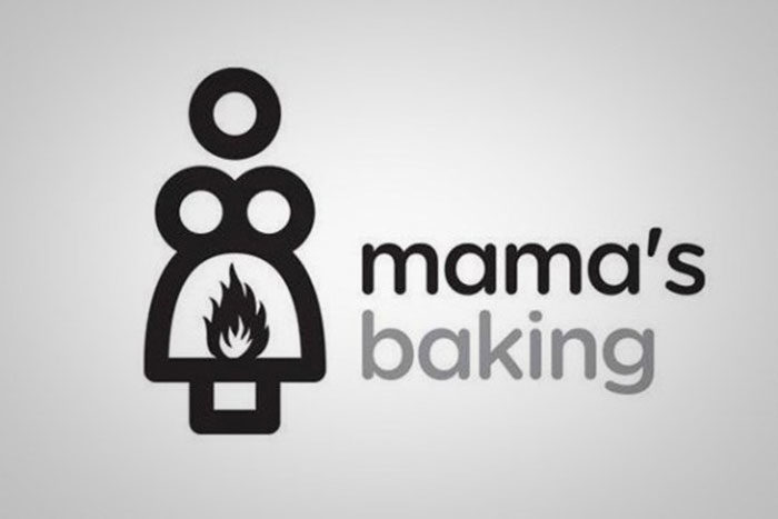
Mama’s Baking
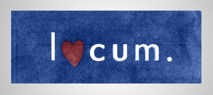
Locum
Kraft Foods

Catholic Church’s Archdiocesan Youth Commission
MSN

PathMark

Clinica Dental

The Computer Doctors

Arlington Pediatric Center

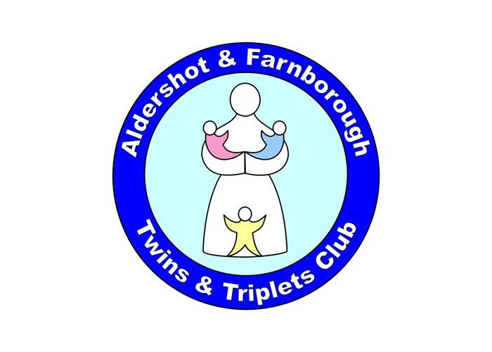
Aldershot & Farnborough Twins & Triplets Club
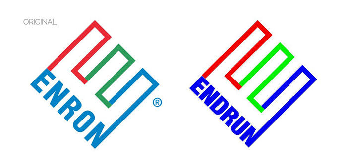
ENDRUN
Kostelecke Uzeniny Sausages

GAP 2010

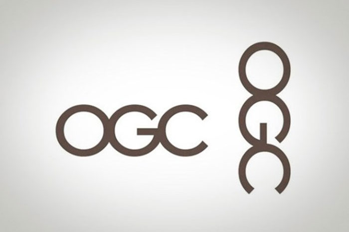
Office of Government Commerce
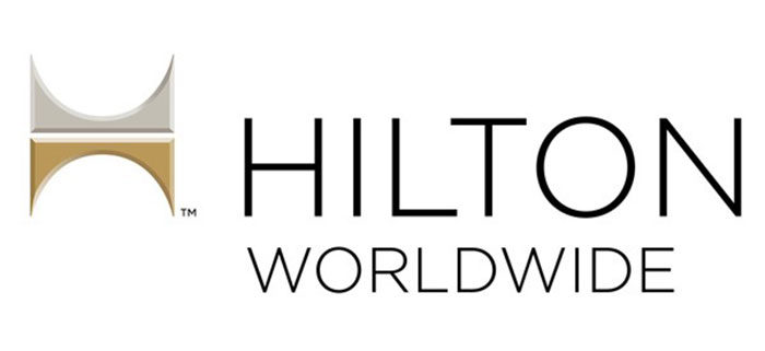
Hilton Worldwide
Kudawara Pharmacy
Portland Trail Blazers

The Cleveland Browns

Institute of Oriental Studies

How to avoid having bad logos
Bad logos often have many commonalities. Mistakes that you should avoid include:
A style that is not uniform

You might have more than one designer that works on the same logo. This could result in awful logos as they do not share the same ideas and the combination of ideas and elements that do not match is a terrible idea. If one works on the font and the other on the icon, the composition could be unbalanced.
Avoid plagiarism

One of the worst logos is one that lacks originality and in addition, this could also lead to unwanted lawsuits from multi-million-dollar companies.
When it is too straightforward

Simplicity is important, however, overly simplistic can also be excessively boring and ends up as poor logo design. The challenge is to find the perfect balance between simplicity and complexity.
Avoid excessive complexity

You want to avoid a logo that is stuffed with concepts and meanings that do not fit together. It will be difficult to decipher and perceive. Complicated logos will be impossible to understand.
Avoid focusing on modern trends

You get good and bad logos that are focused on modern trends. Keep in mind that trends fade as fast as they arrive, and you will not impress with a logo simply based on trends.
If you enjoyed reading this article about bad logos, you should read these as well:
- Clever food advertisements that promoted these brands
- How To Make Great Poster Designs (156 Examples)
- 10 Important Qualities to Look for in a Logo Designer
The post Examples of bad logos and how you can avoid designing one like this appeared first on Design your way.